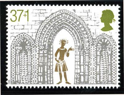
Amongst the most magnificent of all Christmas issues was the 1989 set of five celebrating important architectural features of Ely Cathedral in Cambridgeshire, on its 800th anniversary.
Stunning in gold and silver, it was also unusual in having a charity surcharge of 1p on four of the five values.
The 37+1p shows the Triple Arch from the West Front of the cathedral, in silver, within which is a golden figure with exaggerated features, possibly inspired by the carvings on misericords inside the building.
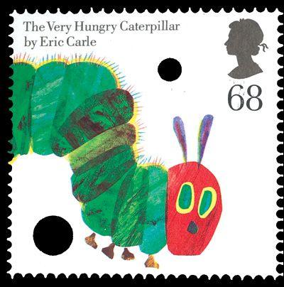
One of eight stamps in a joint issue with the USA – but one of only two designs which were used in both countries’ sets – the Very Hungry Caterpillar 68p is unique among British stamps in having die-cut holes deliberately incorporated into it.
American writer and illustrator Eric Carle made his name in 1969 with his tale about the cute little creature that likes biting holes in things, and it has become very popular with parents teaching young children to read simple words.
Sadly, the US version of this stamp did not have holes, which makes it much less eye-catching!
Design: Rose Design.
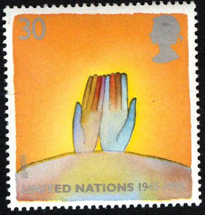
One of two stamps celebrating the 50th anniversary of the United Nations, from a set on the theme of peace, this design uses simple imagery to make a telling point.
Two open hands, suggesting no malice, with fingers of different colours, representing all mankind, emerge from the globe in supplication to the background of heat and flames, alluding to conflict.
It looks like a thought-provoking piece of modern art, rather than merely a postage stamp.
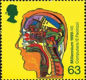
In the first of the Millennium series, the highest value took as its subject the development of computers, commemorating in particular the work of Alan Turing.
A cross-section of a human head has various pieces of computing hardware laid out as if inside a machine, reminding us that the brain itself is a very complex computer, which it had to be to invent the computer!
Design: Sir Eduardo Paolozzi.
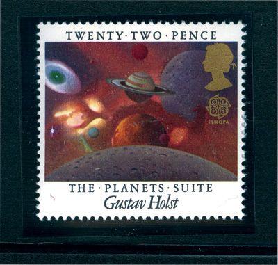
This beautiful stamp for European Music Year celebrates one of the greatest pieces of British music, Gustav Holst’s seven-part orchestral Planets Suite, by trying to capture the beauty of the heavens.
Like the music, the design has real depth.
In the centre are Jupiter, the unmistakable ringed Saturn and the small red orb of Mars.
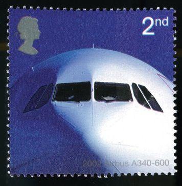
There is no doubting which was the most arresting stamp in the set of five commemorating 50 years of passenger jet aviation.
A beautifully lit photo-essay features the ‘face’ of a contemporary Airbus A340-600, staring back at the viewer like some benevolent monster.
The bulk of the aircraft, which can carry almost 400 people, is not illustrated but is clearly suggested by its massive head, standing out magnificently against an indigo clear sky.
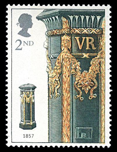
In a year dominated by modern-looking issues, one that stood out was a more traditional one marking the 150th anniversary of the pillar box by showing its development through the years.
The star of this very elegant set of five, based on engravings by the celebrated Czeslaw Slania, was the 2nd class NVI depicting a light green Victorian box with a fantastic array of golden decoration.
Apparently this embellishment was exclusive to the capital cities of England, Scotland and Ireland, in contrast to the plain ‘economy’ version seen everywhere else.
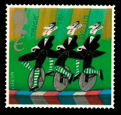
The 2002 Europa theme of the circus must have given designers all over the continent great fun, and was certainly a spectacular series to collect.
Britain’s predominantly greenish set of five stamps concentrated on stereotypical elements of the big top, and our favourite is the Trick Tricyclists design, with its three identical and rather po-faced monocyclists.
One curiosity, immediately beneath the Queen’s head, is the value ‘E’ (for the European letter rate) represented as ‘€’.
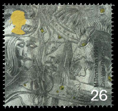
So many stamps were produced in the Millennium series of 1999-2000 that collectors were overwhelmed – and perhaps irritated.
As a result, some wonderful designs have gone largely ignored.
The dominant stamp in the military set, entitled The Soldiers’ Tale, was the 19p depicting Robert the Bruce, but the striking 26p devoted to the English Civil War is a hidden gem, requiring more careful study to appreciate its intricacies.