Jamaica's first issue: Curate's egg?
Jamaica, the largest island in the British West Indies, was the very first British colony to operate its own postal service, having a post office established shortly after it was siezed from the Spanish in the 17th century. But for two centuries the colony’s governors failed to implement an efficient service.
In the end London threw down the gauntlet. In a sharply worded communiqué, it warned that if the island did not start taking proper care of its postal service, then it would no longer have one!
This prompted the authorities in Kingston into action, making the pre-payment of mail mandatory by 1858 (with Great Britain stamps used as a stop-gap measure) and planning the introduction of Jamaica’s first postage stamps by 1860.
Few problems were anticipated, because the London firm of Thomson Hankey & Co had already acted as agents in 1857 for the production of five denominations of revenue stamps by De La Rue, including the engraving of ‘a highly finished head of Her Majesty to serve as the original for all future denominations of Jamaica stamps’. But things didn’t run quite as smoothly as that.
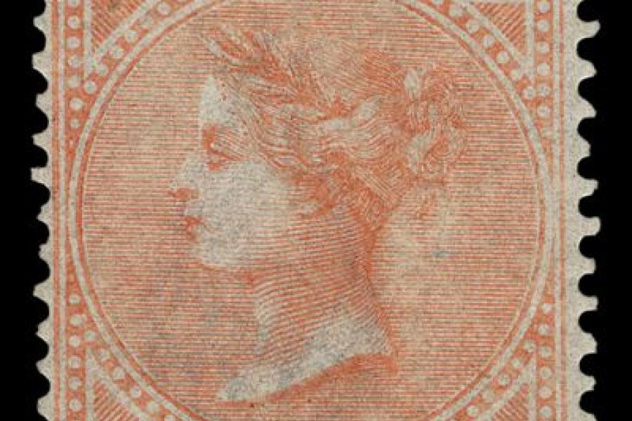
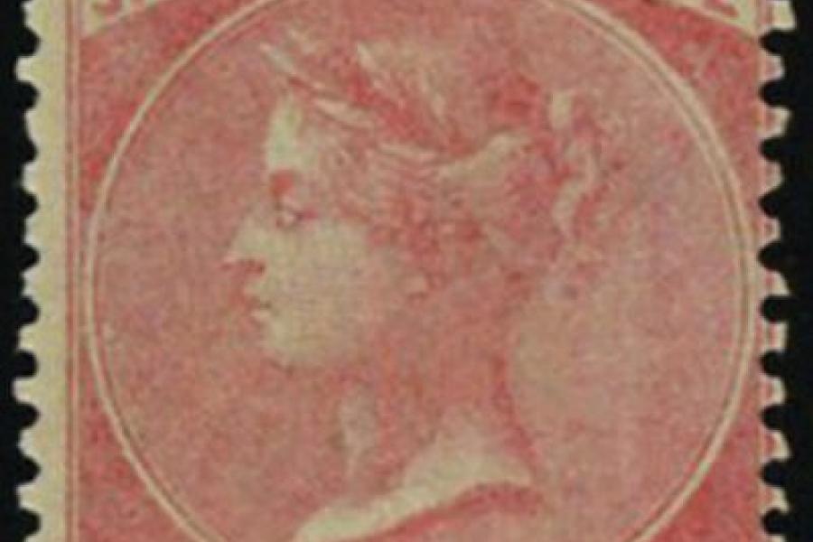
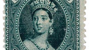
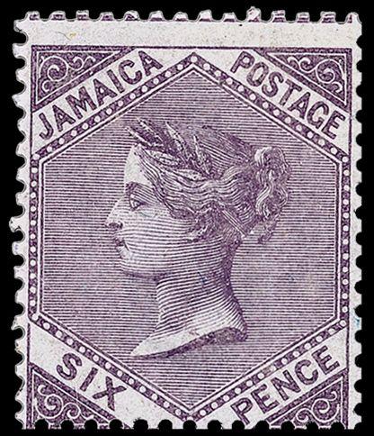
The portrait itself, known as the Diadem IV head and found on no other country’s stamps, had allegedly been cut by the master engraver Jean Joubert, although some philatelic researchers remain decidedly unconvinced about that. Queen Victoria is depicted wearing a curious filet of bay leaves which protrude at the front in a quiff, for a distinctly less regal appearance than that bestowed by the more usual tiara.
De La Rue did its best to dress this up by devising a range of different frames for each of the five initial denominations, but with only limited success. The outcome was a proverbial curate’s egg.
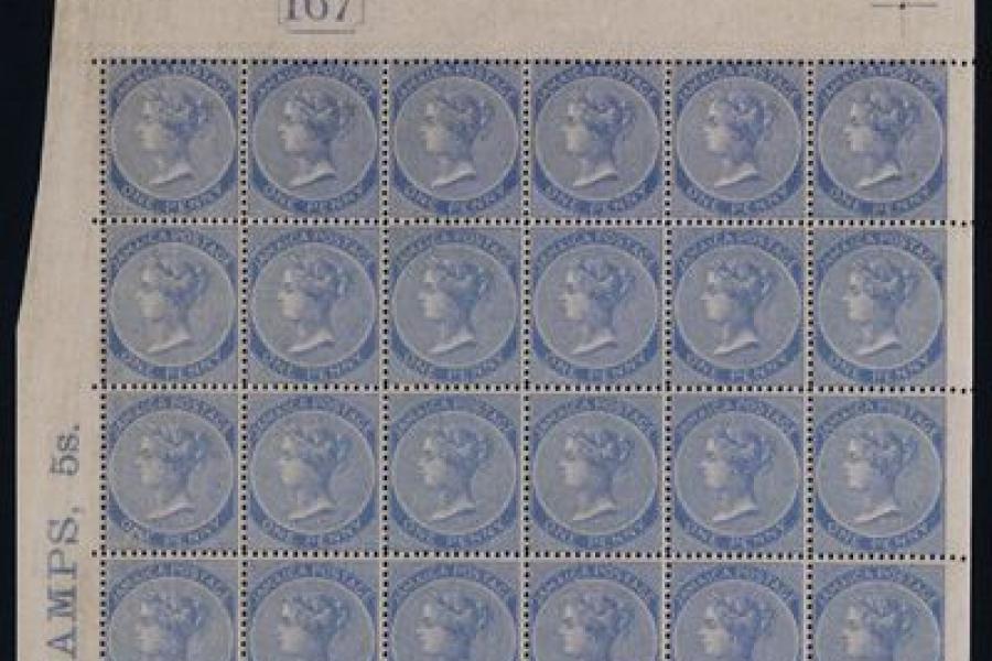
When the stamps appeared on November 23, 1860, typographed in sheets of 240 divided into four panes of 60, several of the designs were greeted with dismay.
The respected philatelic writer John Easton likened the 2d rose, with its curious elongated frame that didn’t seem to fit the format of the stamp, to a bottle label. He also dismissed the 6d dull lilac, with its hexagonal effect that similarly failed to envelop the Queen’s portrait, as unbalanced and amateurish.
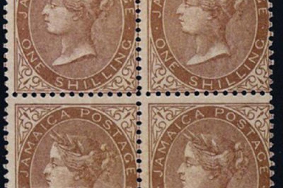
He reserved his opinions of the 1d pale blue, the 4d brown-orange and the 1s yellow-brown, although when a 3d green was added to the series in 1863 (in a design similar to that of the 1s) he described it as ‘a mangled and twisted head fitting a small oval’.
It didn’t help that the perforation of the stamps, to a gauge of 14, was carried out at Somerset House, as De La Rue had yet to install the appropriate machinery. Poor centring is a feature of all six values.
Whatever its aesthetics, the series enjoyed a long life, with five of the designs being reprinted in the 1880s and the 1s value as late as 1897. It can also boast some redeeming features which add extra interest for collectors.
One delightful touch was the Chafford Mill watermarked paper used until 1870, each sheet of which contained 240 pineapple designs in a nod to the culinary speciality of the island. Just as the Diadem IV head was unique to Jamaica, so too was this watermark.
An eye-catching flaw is found once on each sheet of the 1s, where the ‘S’ in shilling appears as a dollar sign.
And a wonderful twist was provided when the diagonal bisecting of the 1d stamp was authorised in 1861 to meet the postage rate for books. Some islanders abused this facility by using vertical bisects, and by illegally bisecting higher values, so an unusual combination of collectable covers was created before the concession was withdrawn the following year.
